
Small Decisions, Resolved Spaces
Small, considered decisions — around layout, storage, and structure — shaped this vacation home renovation project. These three examples show how each constraint was resolved to create spaces that work clearly and efficiently.
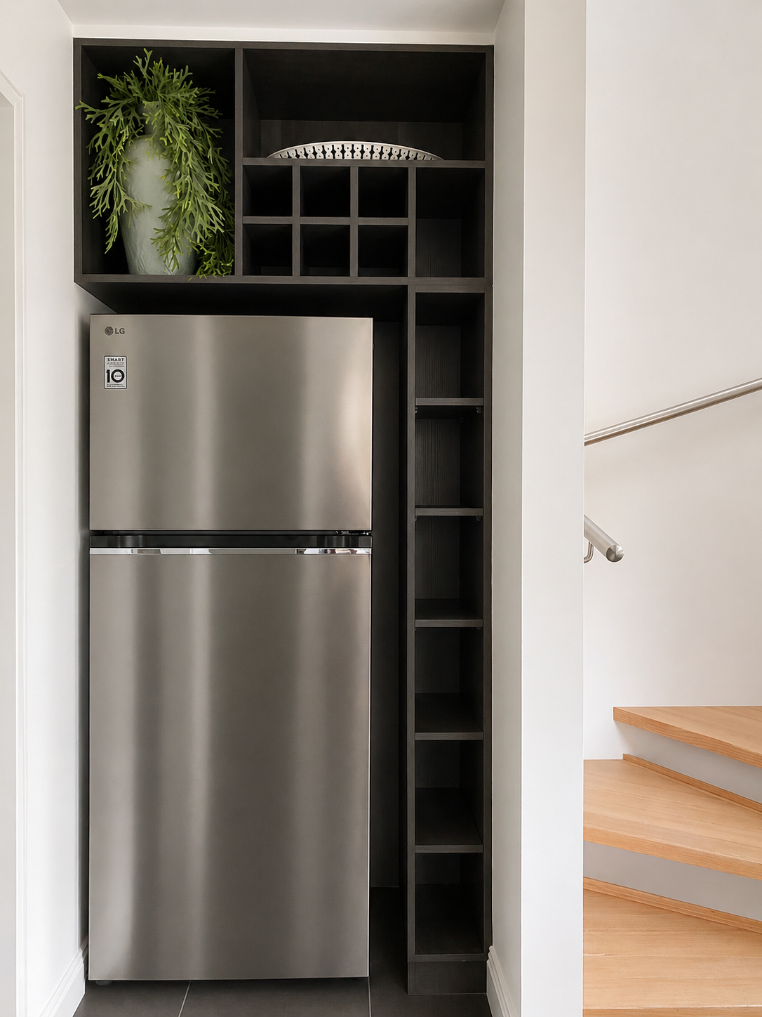
1 | Fridge Joinery
This wasn’t about boxing in a fridge, it started with relocating it.
The fridge was originally positioned within the kitchen run, taking up valuable space. Moving it out allowed the kitchen to function more clearly, but required the new location to be properly resolved (something that often becomes clear through the planning and documentation stage of a project).
Turning a utility into a feature
Framed within joinery, the fridge becomes part of the architecture rather than an afterthought.
Using vertical space
Overhead storage, a wine grid, and narrow shelving:
maximise a tight footprint
add usable storage
draw the eye upward
Creating soft zoning
A taller vertical section defines the edge between:
kitchen
circulation / stair
Anchoring the fridge in place.
Flexible, rental-friendly storage
Open elements are:
easy to understand
intuitive to use
visually relaxed
A lighter, cost-conscious approach
The result achieves a built-in feel, without the cost of a fully integrated system. (A similar approach was explored in other areas of the project, where function needed to be resolved without overcomplicating the build).
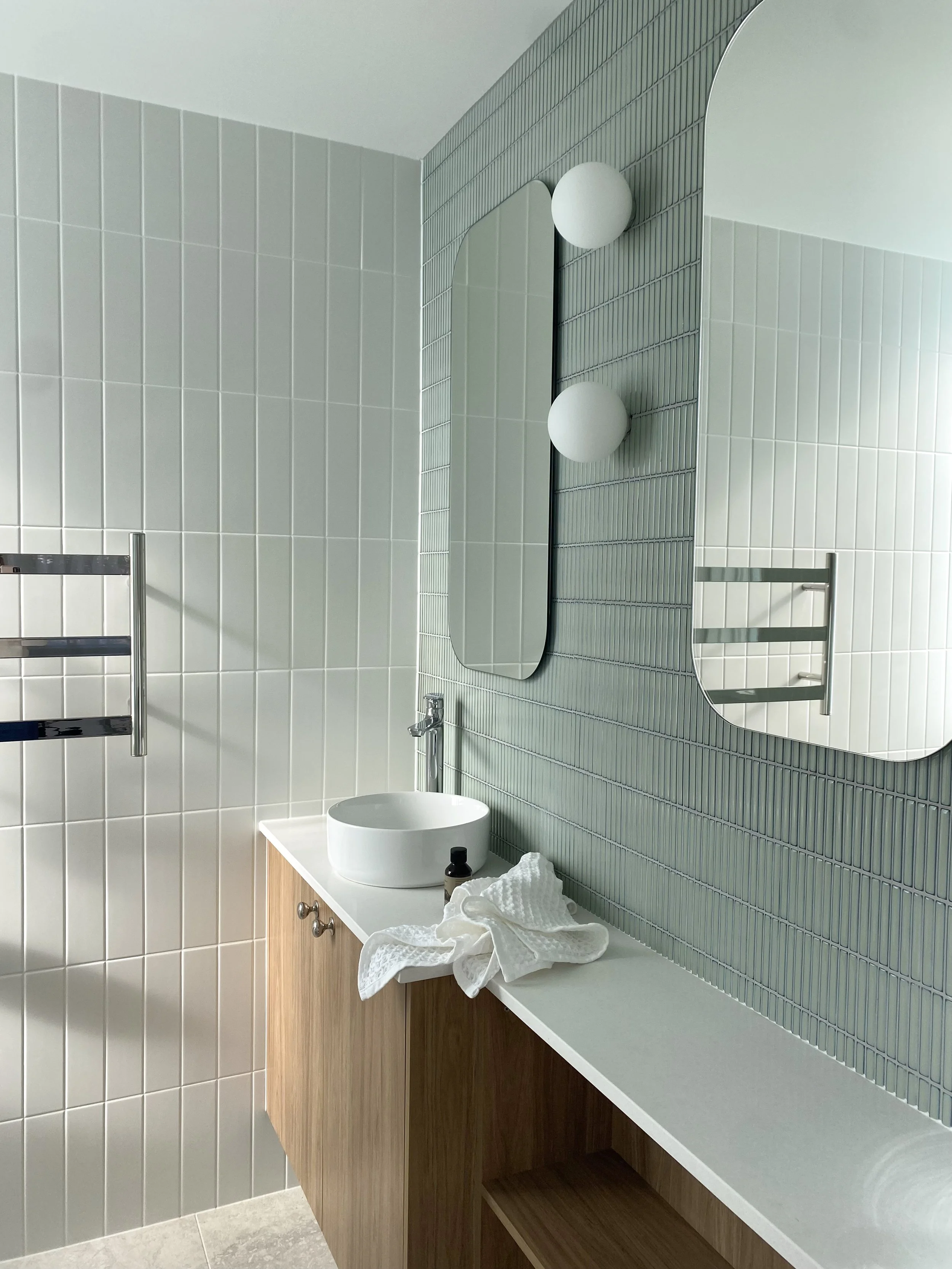
2 | Ensuite Bathroom Vanity
A standard vanity wouldn’t fit within this small footprint, so the approach was to adjust to the reduced space. A 300mm diameter basin had been selected to suit the scale of the room.
Out-of-plumb walls required shimming to bring them into alignment, which further reduced the already limited footprint. With an existing pocket door in place, wall space was also lost, tightening an already narrow bench.
Responding to the constraint
Functional drawers couldn’t be accommodated within the revised available depth, so the design was pulled back. Open shelving was introduced below, while the benchtop above remains usable as a place to put items.
Reframing storage
The area below the bench was left open:
easy to access
visually clear
no need to search or open cupboards
Designing for guest use
In a holiday rental, this works well:
items remain visible
the space feels intuitive
guests are less likely to leave things behind
Maintaining usability
The smaller basin and reduced depth allow the bench to function comfortably without feeling cramped.
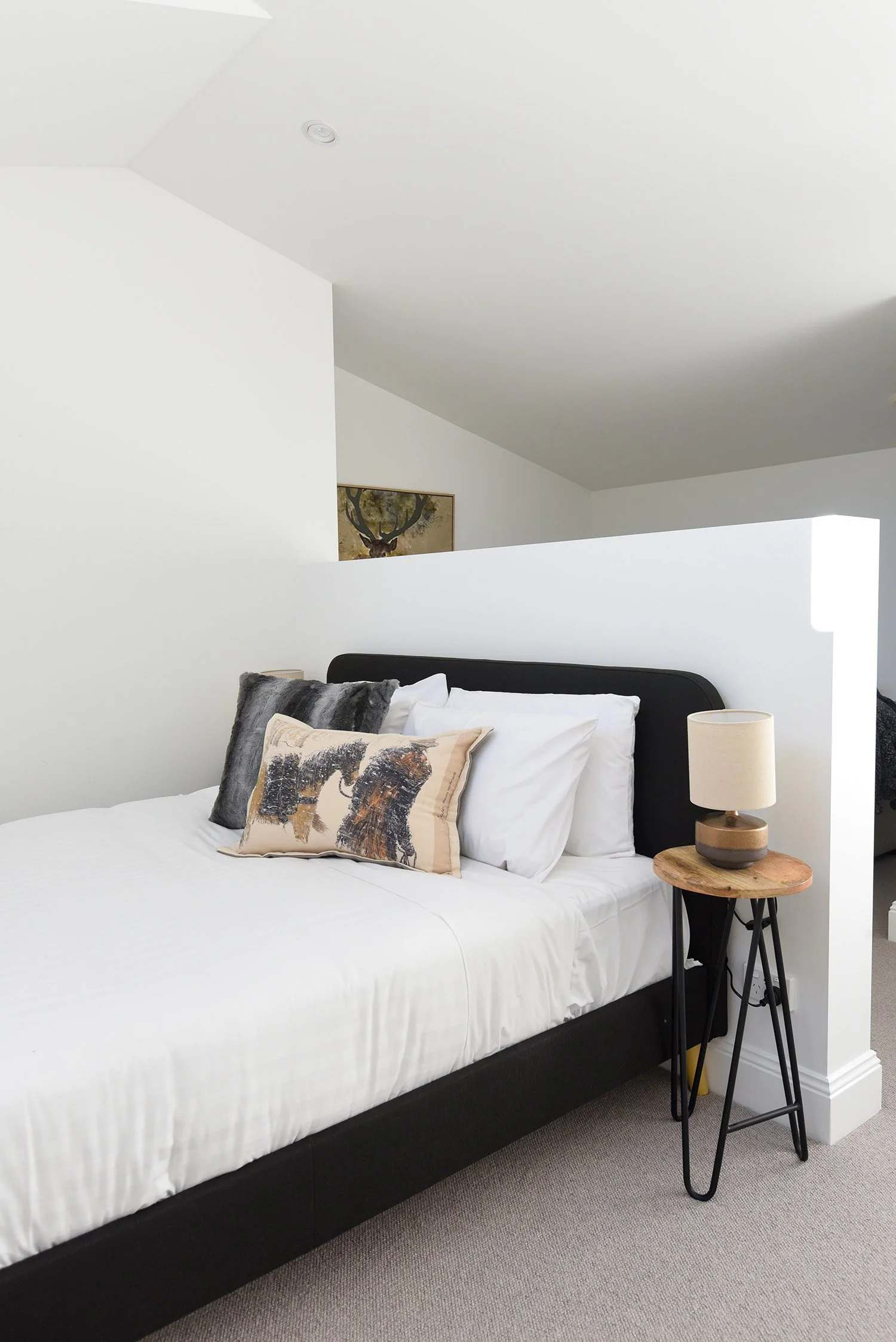
3 | Mezzanine
The mezzanine was constrained by a sloped roofline and limited head height, which left it without a clear use.
The approach was to introduce structure and define how the space could function.
Working with the space
Rather than treating it as a single open area, a low wall was introduced to organise the layout.
Embedding function
The wall performs multiple roles:
headboard to the bed on one side
mounting point for the TV on the other
Creating two zones
This allows the space to function as:
a sleeping area
a small sitting area
Without enclosing the room or adding bulk.
Orienting for use and outlook
The sitting area is positioned for the TV, while also capturing a glimpse of the mountains, adding a small but meaningful connection to the surroundings.
Maximising a limited footprint
Two uses are resolved within the same volume, allowing the space to work harder without increasing its size.
These are small decisions, but they shape how a space functions — and are best resolved early, before anything is built.